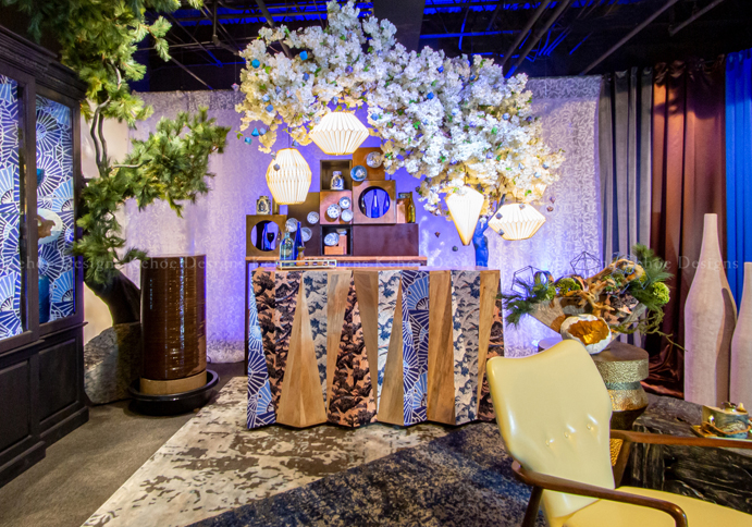
What happens at a Chicago event when you combine Pantone’s Color of the Year with Japanese design and cherry blossoms?!? An ethereal setting where traditional and unexpected elements collide, for an event to remember.
Kehoe Designs’ “Deep Sky” trend board inspired Senior Event Producer Sophia Lin Kanno’s design installation, especially because of its nod to Pantone’s Color of the Year, Classic Blue. “Pantone acknowledges that 2020 begins a new era,” Kanno says. “However, a new decade brings uncertainty. That’s why the color references dusk, where we go from day to evening. It’s not a bright, daytime blue, or evening darkness. Instead, Classic Blue hovers between the two, speaking to the unknown, which we celebrate as an event industry trend this year.”
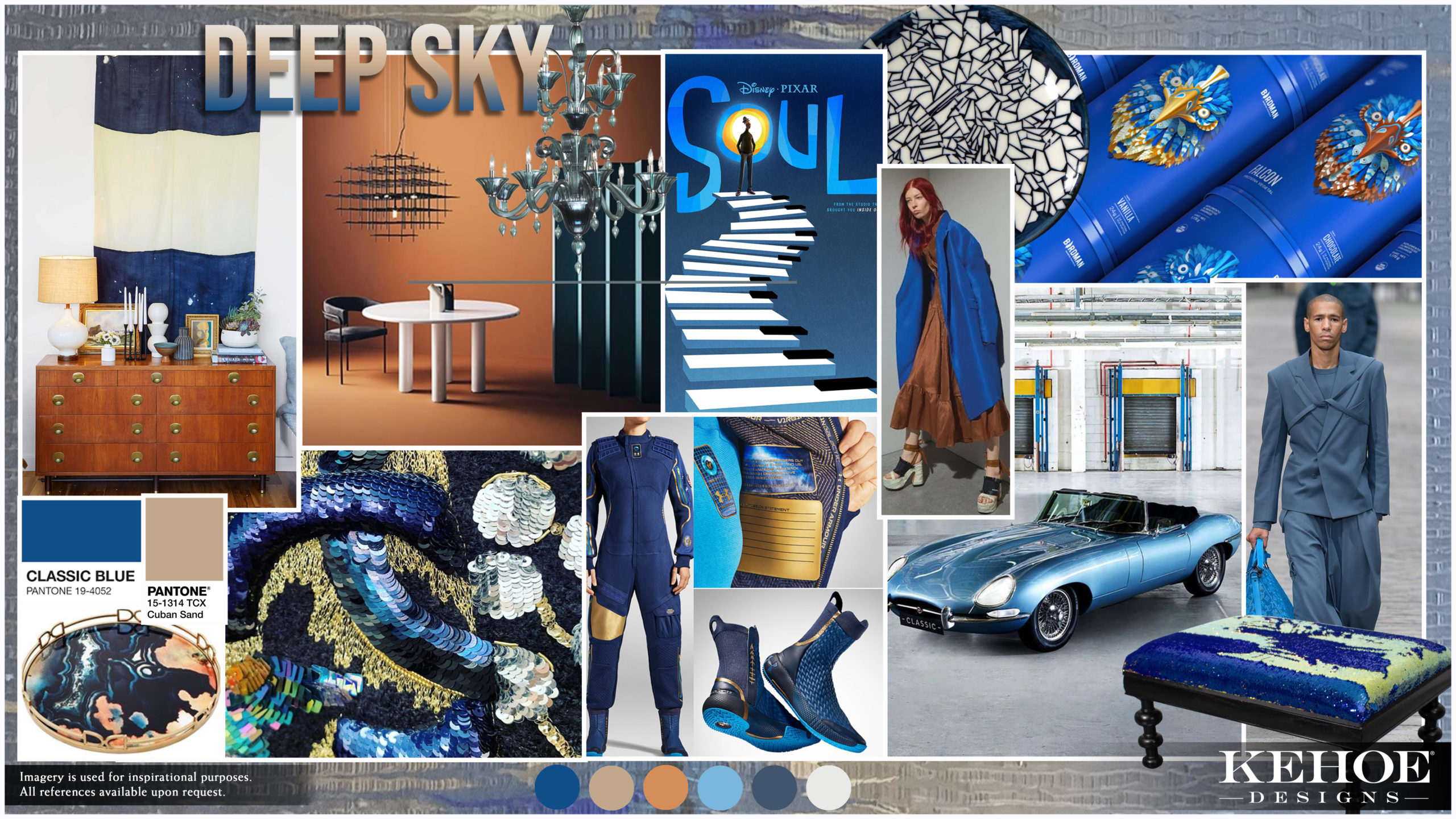
Kanno’s personal heritage and the 2020 Olympic effect also drew to the “Deep Sky” trend board. “I was born in the United States, but my family is from Taiwan,” she says. “Since Taiwan was a territory of Japan for 50 years, my grandmother speaks Japanese. There’s a significant influence of Japanese culture on Taiwan. And, my husband is Japanese. I wanted to highlight those Japanese cultural associations in Chicago events.”
Kanno posits that Japanese design is methodical. “We referenced Japanese culture through a systematic installation process,” she says. “Yet, I wanted to allow for playfulness and innovation. My goal? Chicago events where the traditional meets the surprising.”
Get Lost in ‘Deep Sky’
Pantone’s Color of the Year 2020 is a familiar, calming shade of azure offering quiet reassurance. “This hue honors our feeling of anticipation, but it’s also down-to-earth and confident,” Kanno says. “This Pantone blue works across genders. It’s also easy to incorporate into fashion, design, luxury living and as an industry trend in Chicago events.”
When Kanno started conceptualizing her installation for Chicago events, she wanted to juxtapose calmness with boldness. “There’s tranquility and peace in Japanese design, especially using natural elements like cherry blossoms and water,” she says. “However, I combined layered patterns for a streak of certainty and confidence.”
The Pantone Color Story
Kanno used Pantone’s Color of the Year 2020 as a jumping-off point. “Classic Blue complements Cuban Sand, another key color in my installation,” she says. “Cuban Sand has a flush of warm golds and browns, and emulates a wood grain.”
You’ll also see browns in tall clay vases, in the bar and shelving, and even in a cylindrical fountain. “Our tranquility fountain adds an acoustic element to the story,” Kanno says. “Adding natural elements is a 2020 event industry trend.”
Overall, Kanno worked within a blue-and-brown spectrum. “These variations achieved a soothing balance within my Japanese design,” she says. “Yet, mixing in patterns offered a pop.”
Shower Me With Cherry Blossoms
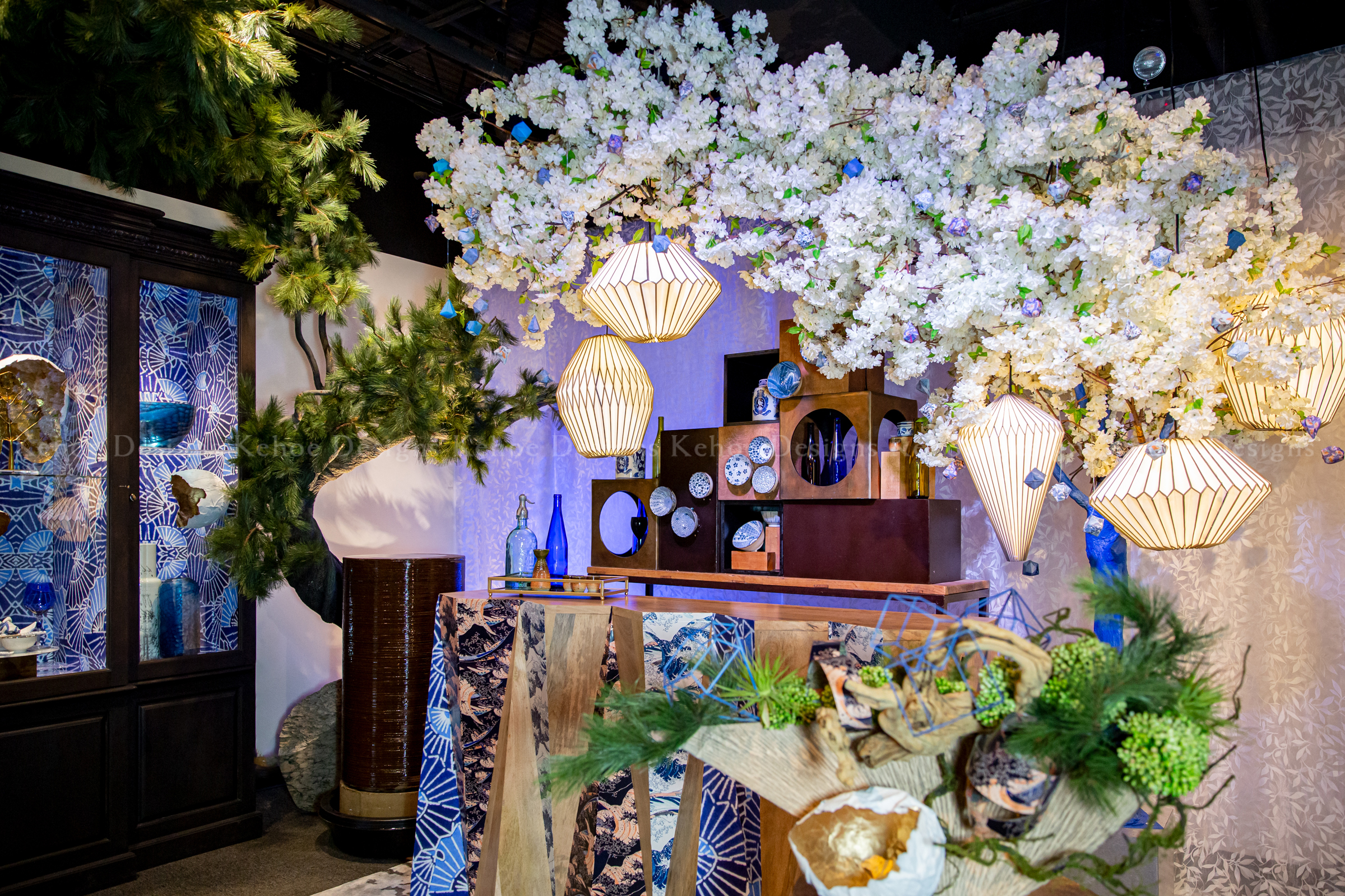
Kanno loves the cherry blossom tree, so she figured it heavily in her installation. “The cherry blossom tree is important to Japanese culture,” she says. “Cherry blossoms symbolize resilience, life and brightness.”
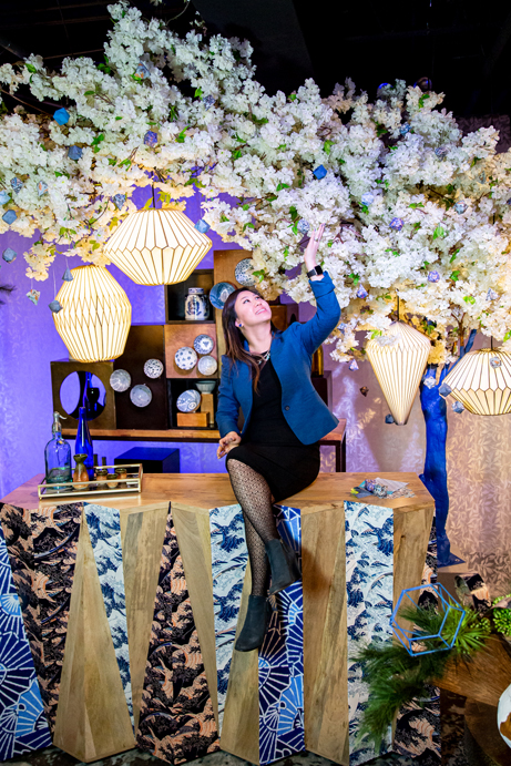
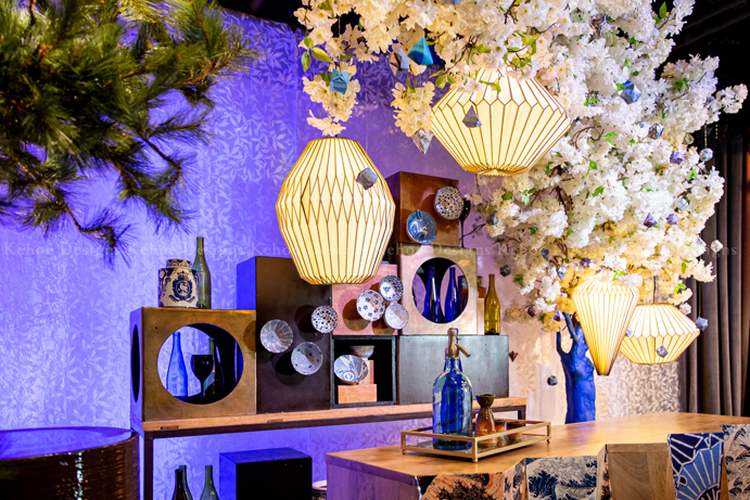
That’s why a dramatic cherry blossom tree with bold blue trunks hovers asymmetrically over the bar. “The trees evoke spring,” Kanno says. “The Pantone blue in the trunks hints at uncertainty. The cherry blossoms hint at something amazing coming.”
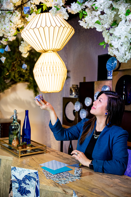
Kanno and the Kehoe Designs team added geometric paper lanterns with precise folds within the branches. “We also interspersed Pantone Classic Blue patterned origami for dimension,” she says.
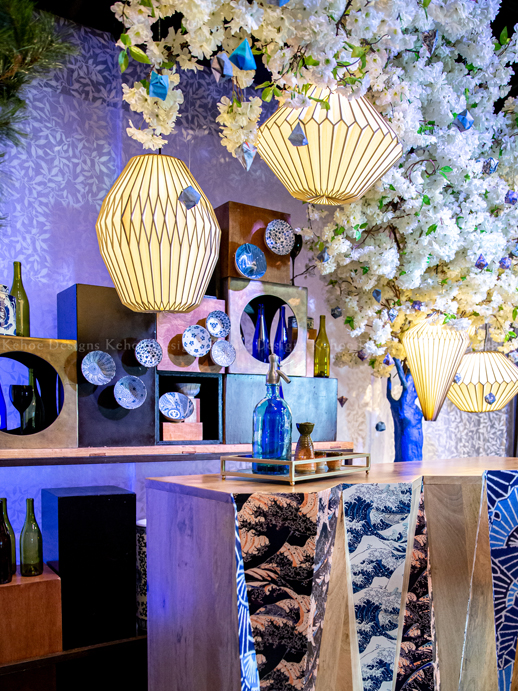
This plethora of origami also emphasized angular, modern pieces in the bar setting. “We wanted a sculptural feel,” Kanno says. “You see that in the triangular pattern shapes on the bar front, as well as on the wooden box-and-vase bar-back arrangement.”
To balance the cherry blossoms, Kanno brought in a selection of tall and wide, deeper green trees. “These bonsai-like trees have masculine energy, in contrast with the delicate cherry blossoms,” she says. “They also offer visual interest within their differing heights, shapes and textures in this Japanese design for Chicago events.”
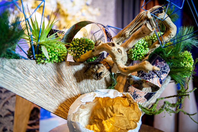
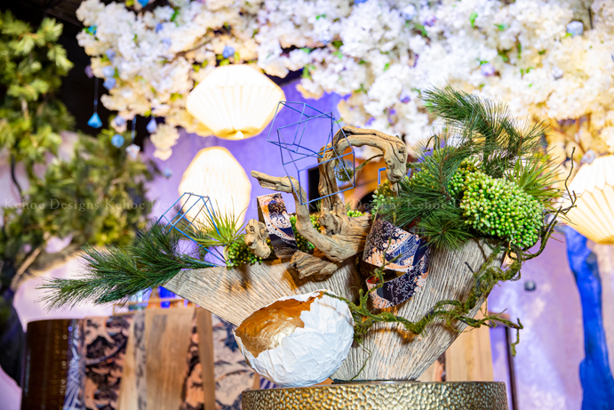
Finally, Kanno created a miniature garden arrangement that includes loops of chigami Japanese paper mixed with bonsai branches. “We also added modern blue geometric shapes to mimic the bar-front patterns,” she says. “Those mix with the florals and natural wooden elements. I brought angular shapes in an interesting contrast with nature, an industry event trend this year.”
‘Deliberate Furniture Choices’
The furniture focal point of Kanno’s Japanese design is a bar. “The bar has a modern, faceted face, but a traditional wood finish,” she says.
The team added patterned Japanese Chiogami or washi patterns, which inspire strength and resilience, to the bar facets. “These recurring wave graphics are a nod to Japanese culture, but also push design differently with deliberate furniture choices for Chicago events.”
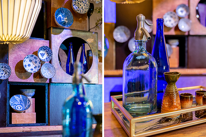
Building on the faceted wood bar, Kanno built a tiered wooden bar-back arrangement. “It’s asymmetrical, so it references a modern interpretation of a Japanese step tansu,” she says. Step tansu pieces appear in traditional Japanese design as storage cabinets under stairs. “We also referenced Japanese china with blue-and-white patterns,” says Kanno, who featured the pieces in an innovative vertical staging fashion.
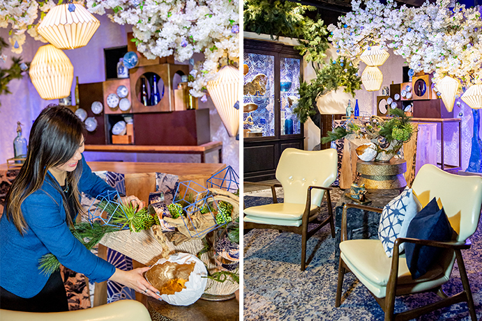
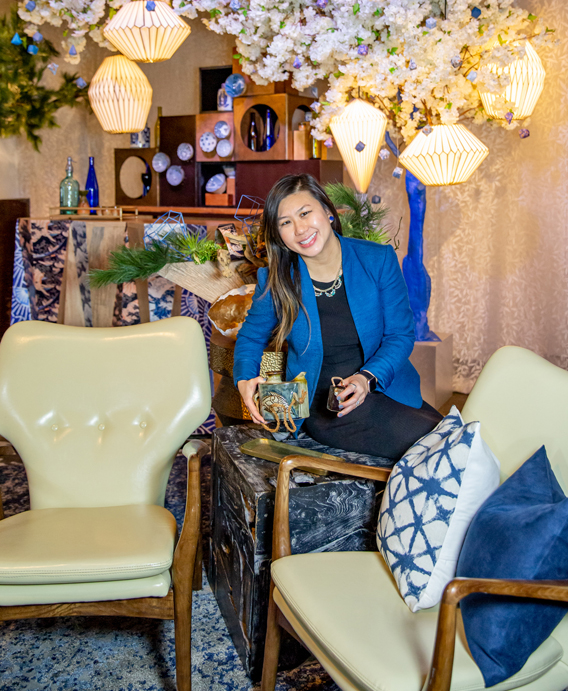
Kanno also chose mid-century modern chairs for seating. “They have a wood tonality to them, with cream-colored leather,” she says. “This is another way we melded a modern-retro aspect. We pulled these pieces together as an event trend.”
Light Up My Evening Sky
Kanno worked with the BlackOak team to create an ombré horizon effect. They infused Pantone Classic Blue into the whole installation. “We did a vertical horizon,” she says. “We focused on the lighting being darker on one side and transitioning to lighter.”
“Lighting is a powerful form of decoration that can emphasize architectural features and décor pieces, transforming a bland space into a stimulating atmosphere,” says Ash White, producer at BlackOak Technical Productions. “Certain colors evoke different emotions within us. As a result, while working with Sophia on this installation, we focused on the blues that symbolize luck in Japanese culture. We created a tranquil environment respectful of Japanese values.”
The team also used a soft chase in the background to add dimension and movement to engage Chicago event attendees. “Touches of white light on the beautiful cherry blossom trees prevented them from disappearing,” White says. “In addition, the lighting draws the eyes upward to the cherry blossoms.”
The hanging lanterns imbued an additional soft, golden effect. “We further illuminated the cherry blossom trees,” Kanno says.
We Love Textures and Patterns
Kanno chose two powerful patterns to invert against each other on the wooden bar. There’s a dark-and-light tonality to the fans and waves. This echoes the larger “Deep Sky” transitional theme. “The wave pattern also includes concentric circles layering and creating arches,” she says. “In Japanese culture, the wave represents surges of good luck, along with power and resilience. You also see waves in kimono patterns.”
The juxtaposition of sky hues and wave patterns also symbolizes the meeting of sky and sea. “We evoked the movement of water,” she says. Those Pantone Classic Blue-hued patterns of contrasting motion also appear on pillows and strategically placed bowls and vases.
The main backdrop fabric is an ivory with a textured leaf pattern. “This echoes my choice of natural elements, an event industry trend,” Kanno says. “Plus, it allows the lighting to reflect transitioning from day to dusk into evening. The overall fabric selection includes texture, to show that nothing in nature is perfect, perfection is in the imperfection.”
Kanno layered patterned rugs on top of each other for a lavish effect at Chicago events. “It’s the look and feel of Persian rugs under your feet,” she says.
‘Deep Sky’ (and Beyond) at Chicago Events
While Kanno used her personal heritage and Japanese culture to inspire her installation, she believes anyone (or any company) can incorporate Japanese design into their event, especially with the nod to the Olympic effect . “Connect to the symbolism behind the cherry blossoms, patterns or furniture,” she says. “What link can we make between Japanese design and my client’s story? Then, we make it a cohesive theme for that particular Chicago event.”
Kanno recognizes that color plays a huge part in Asian weddings and celebrations. That’s why she loved the “Deep Sky” Pantone blueness. “Blue is a symbol of wealth in China,” she says. “That’s why Chinese pottery is covered with cobalt and blue patterns. In Japanese design, pottery also plays into that idea.” Building on that, Kanno notes that “red is a very lucky color. Gold also is a big part of weddings but this interpretation allowed for an unconventional inclusion of high society Asian design.”
She sees shades of Pantone Classic Blue starring in weddings and corporate Chicago events this year. “The idea of the sky is embracing the unknown,” Kanno says. “I see my clients using the sky or sea as part of their Chicago event story. It’s that representation of exploring the future, as a 2020 event trend.”
Ultimately, Kanno loves mixing the traditional and modern, and creating unexpected event spaces. “I want to push Chicago events forward, with stories, patterns and layering,” she says.
On the Hot Seat with Sophia Lin Kanno
What inspires you on a daily basis?
SLK: I’m inspired by people’s stories. Purposeful design is important. There’s more to a Chicago event than gorgeous aesthetics. (Although, who can resist cherry blossoms and Japanese design?) I love asking other event designers and producers about the stories behind their events. There are layers to the storytelling aspect of design. That’s why I’m inspired by my clients when they tell me their story or the message to convey in their Chicago events. Then, we tell their story through the event.
When people don’t understand what my role as an event design producer is, I tell them to think of the process and mindset of a movie set designer. What is the event scene about? Explain the feeling and emotion of the scene. Share the message. What are the visuals and symbols we use to communicate our theme? Are there industry trends that we can weave into the setting? How many ways can we help people visually see and experience that story and theme?
Any event trends you’re excited about this year?
SLK: We are continuously connected and dependent on our phones. Many people find it hard to separate from technology. That is why I felt strongly about my nature-inspired installation, which transports people to a tranquil setting. Yes, we love our Instagram moments that give us social media cred. But how do we let event guests enter into a calm oasis? At some Chicago corporate events and weddings, the event industry trend is to ask guests to check their smartphones at the door. They’re saying, “We’ve hired a photographer to capture these moments, so just enjoy yourself.”
Any advice you can offer up-and-coming event designers and producers?
SLK: Don’t be afraid of being true to your design aesthetic. Sometimes event producers doubt themselves: “This wedding theme is too busy. This idea is too edgy or culturally too far for that corporate event.” The idea is to believe in your own aesthetic—and push it. Find your special point of view. For example, my background, heritage and interaction with Japanese culture gives me a different design perspective. Have confidence in your craft and believe that your designs, no matter how unusual or different they may seem, tell the rare story of your journey, one that true designers and story devotees will respect and appreciate.


