Ecolab | Design Challenge
We are very fortunate to work with clients who year after year, allow us to take our creativity to new frontiers. Today, Kehoe Designs shares five event designs for Ecolab, an innovative company who has given us the opportunity to re-envision client functions by incorporating their products as both artistic and experiential elements in their events. It all began in 2010, when for their much anticipated Chairman’s Gala, a party held in conjunction with the National Restaurant Association (NRA) show, Ecolab expressed interest in exposing new products to their guests. “The goal was to reinforce the brand and familiarize potential clients with their product lines without being too literal or in your face about it,” explains Event Producer, Lindsey Lider. In this feature, we show how the Kehoe Designs team responds to the design challenge of unconventional materials and the call to keep Ecolab’s annual event exciting and fresh with new themes every year.
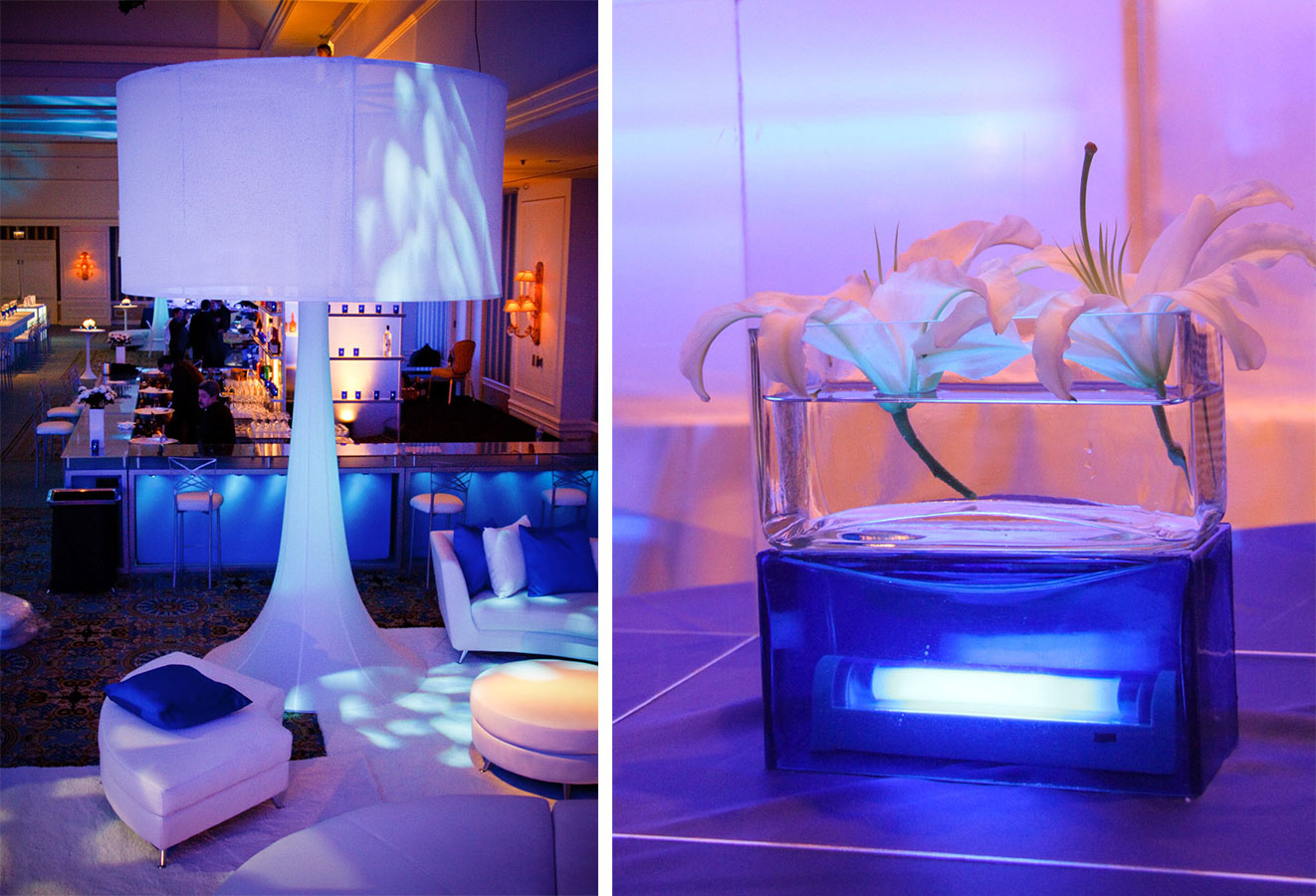
2010: Under Water
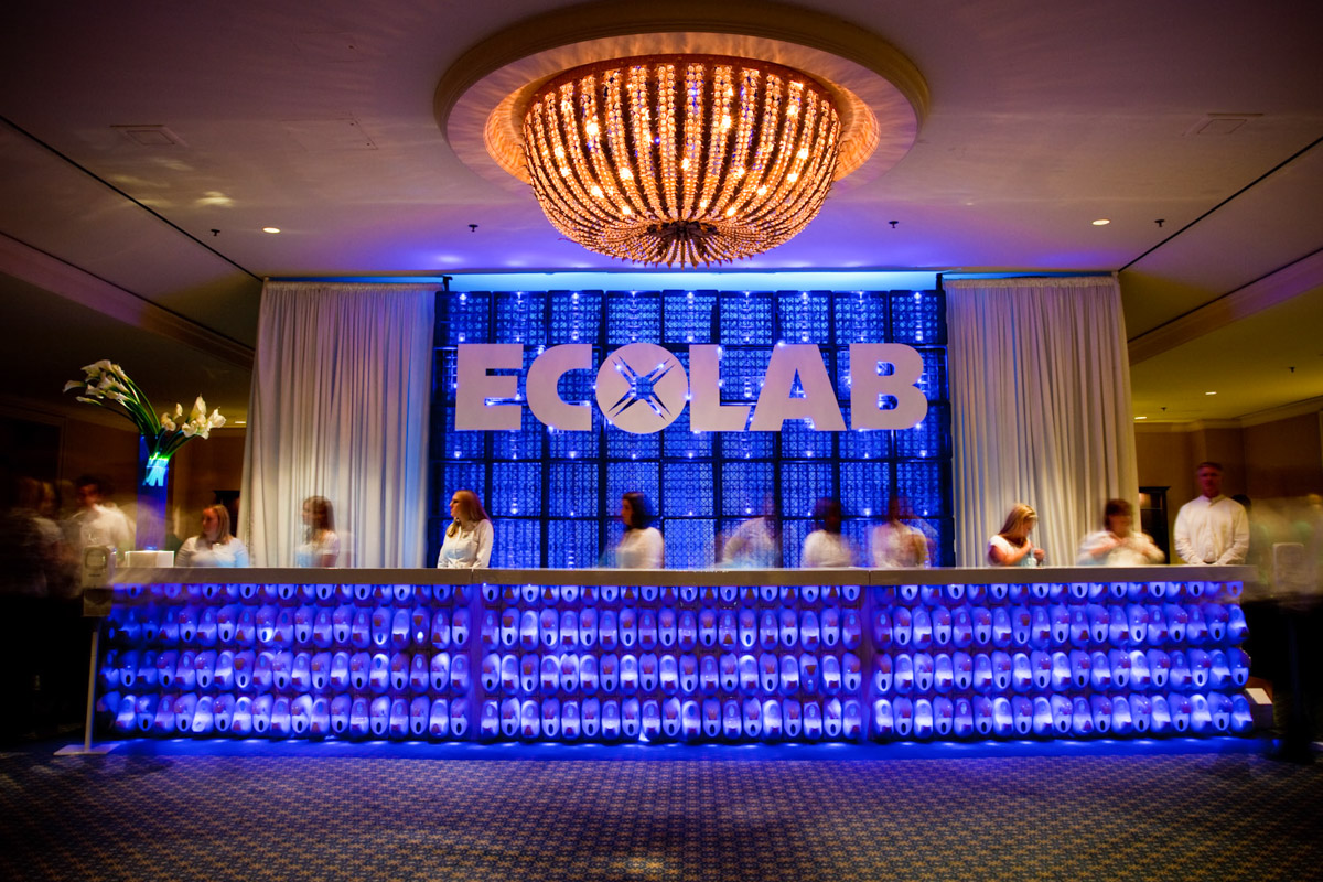
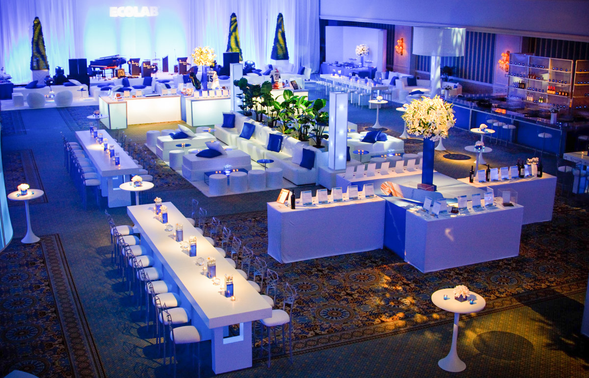
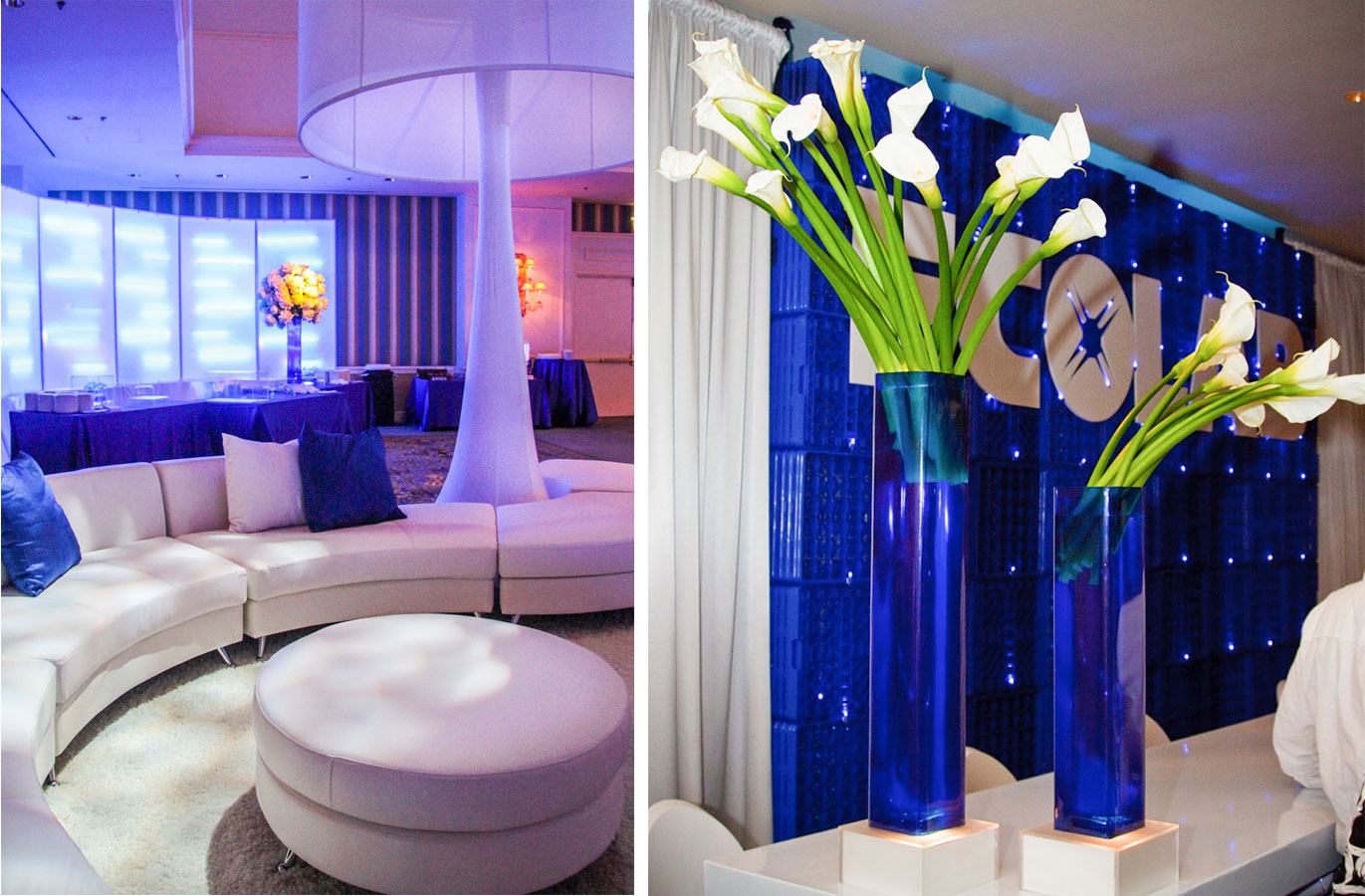
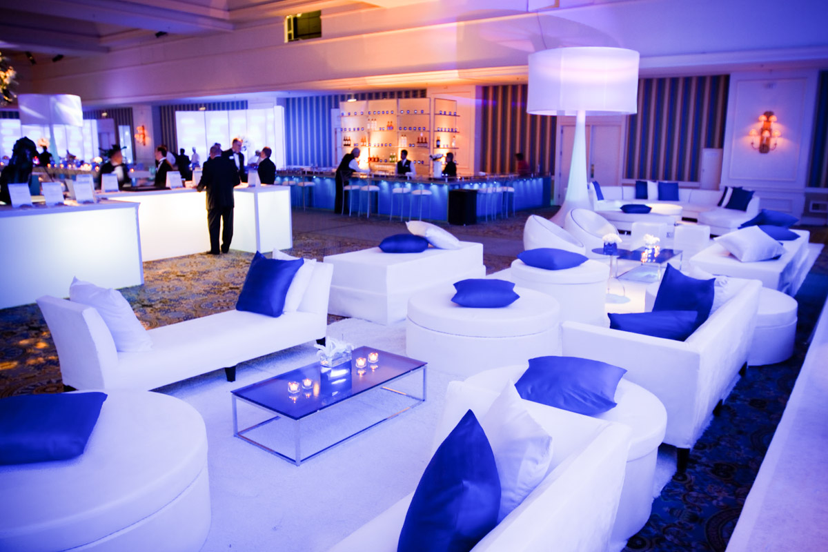
“In 2010, our main inspiration came from the concept of being submerged,” explains Creative Director, Bridget Frizzie. “Everything revolved around water; things you’d see beneath the deep blue sea. It also spoke to life on a cellular level,” she continues to say. “Soap dispensers affixed to registration tables, for example, mimicked how a cell operates as an individual element but when merged together into a cell wall, turns into something totally different.” Also playing off of patterns and repetition were Ecolab’s blue dish racks, stacked and backlit for an impressive backdrop to their branded sign. “Most important to our client was to keep the brand name prominent while designing product-centered decor that felt inventive, fun and fresh,” says Lindsey.
2011: Geometric Curves
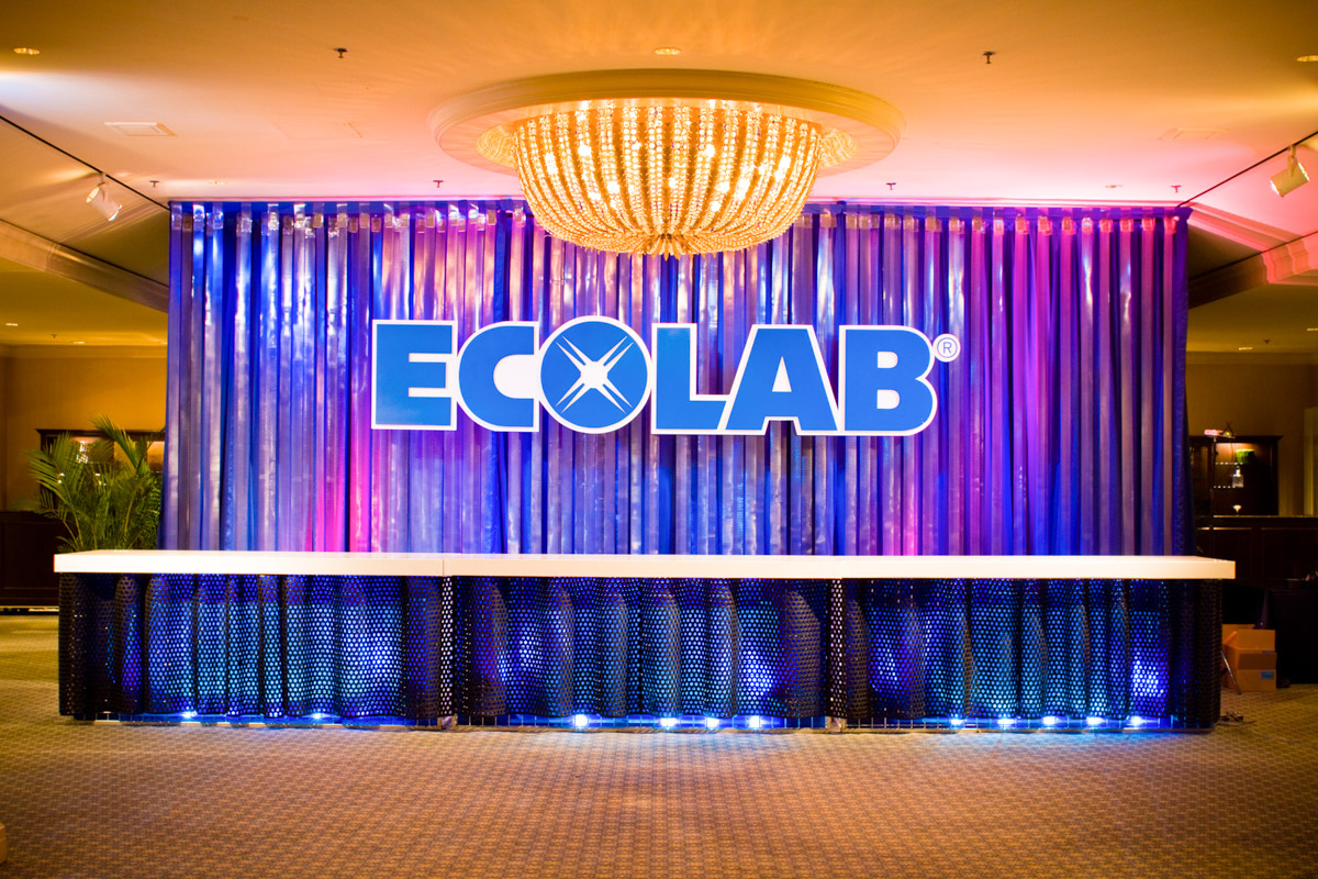
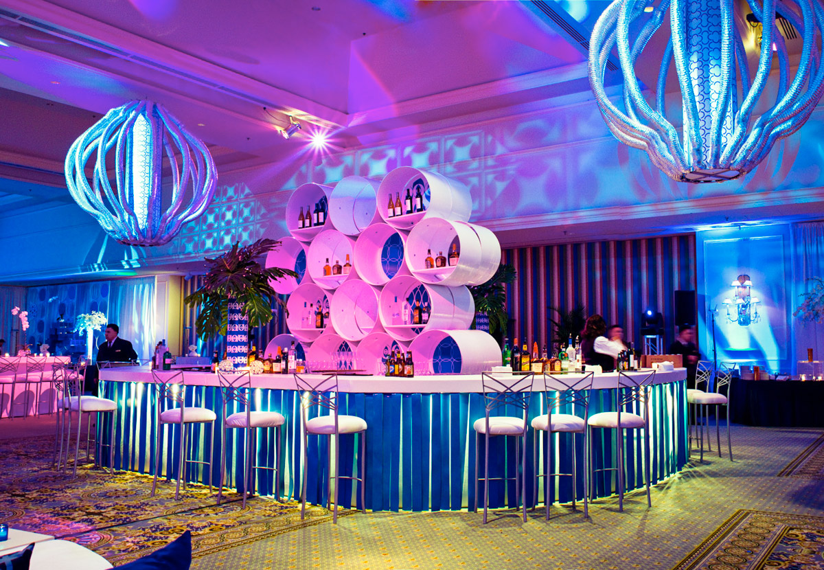
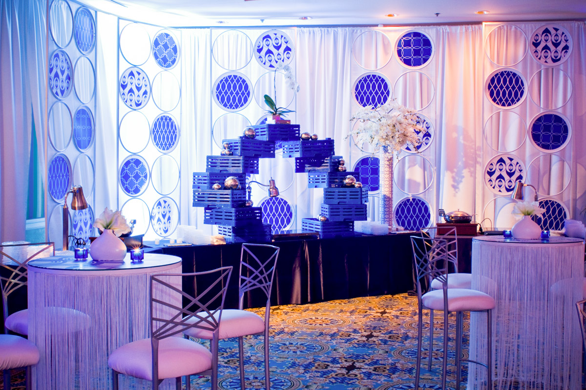
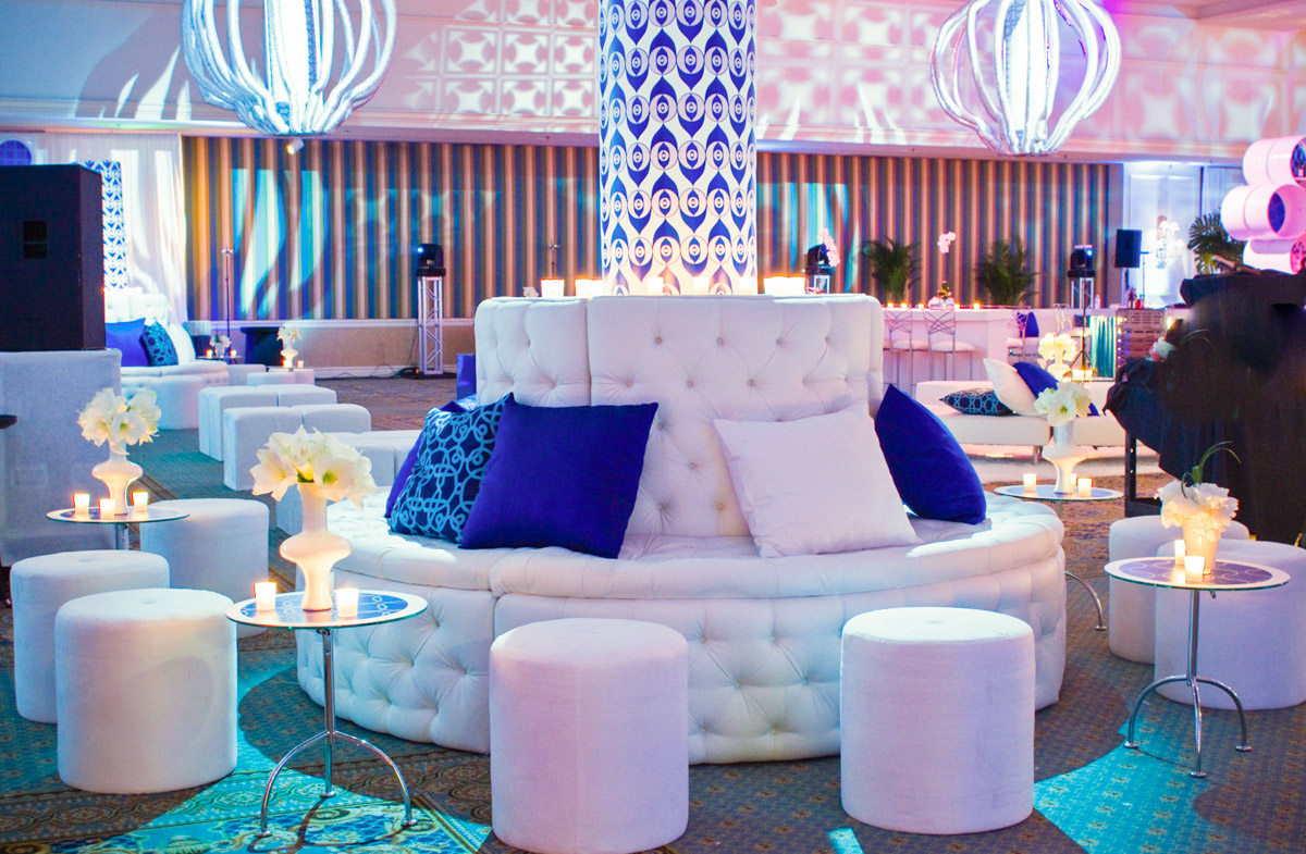
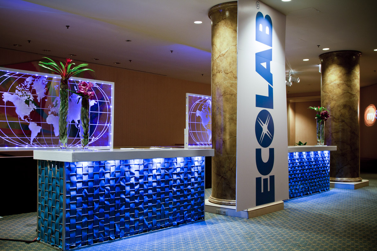
With Ecolab products stored in our studios, the creative design team had a head start on re-imaging the ways they could incorporate the company’s cleaning products into the coming year’s decor. “For the second year, we used their flexible food prep maps to skirt registration tables while the back wall was given a fringe treatment using their walk-in refrigerator insulation flaps,” says Lindsey. “It was all about geometric patterns and circular design,” continues Senior Designer, John Beran. “We wanted to showcase their trademark blue with smart, bold patterns designed within series of curvy and circular repetitions.” Even the square dish racks were fused together to become a circular element on the buffet display. As for our custom bar, the design team added an unexpected twist of decorative fringe crafted with Ecolab’s dishwasher strips.

2012: Exotic Ikat
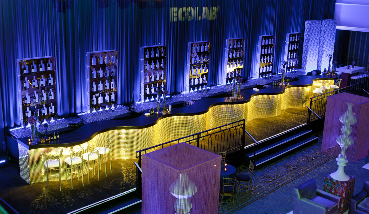
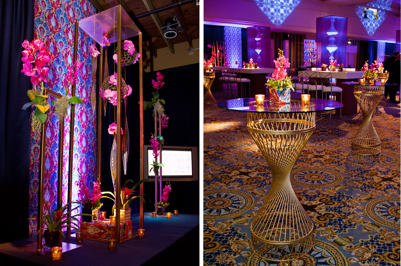
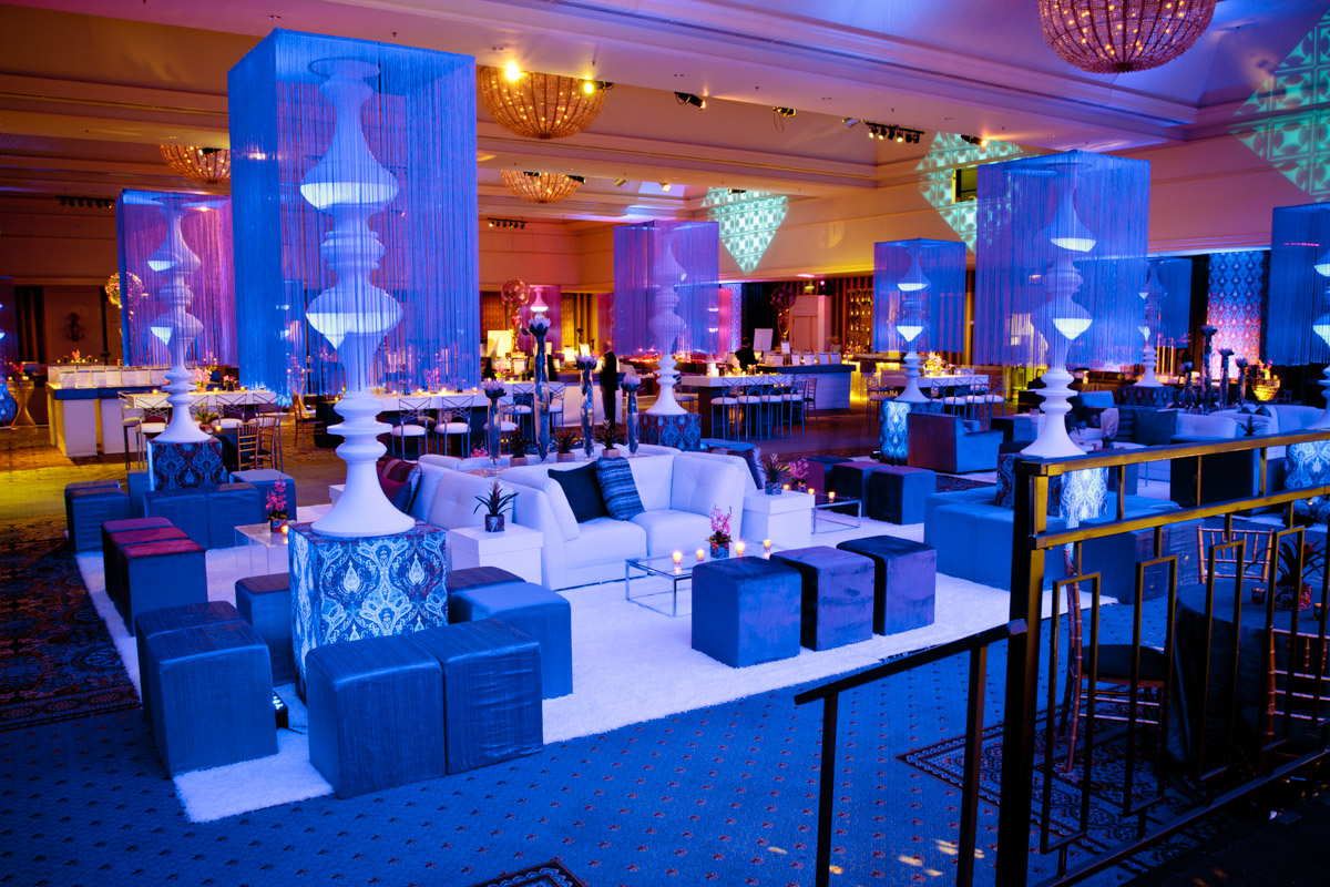
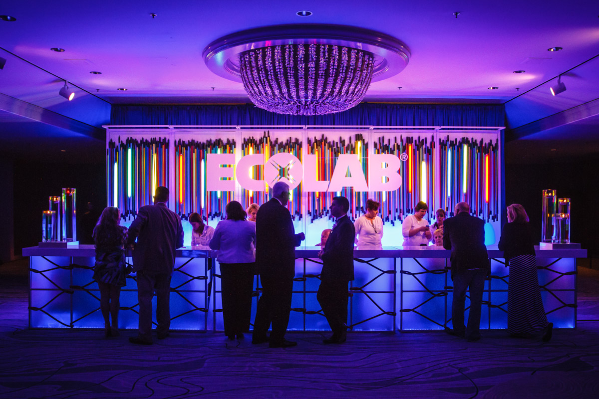
“The third year, we moved away from a clean corporate look toward an event environment evocative of rich landscapes found in far off places,” explains John Beran. Design elements blended patterns, shapes and textures with an exotic feel: curvaceous columns with colorful fringe, Ikat fabrics with rich magenta and fuchsia hues, tropical blooms such as bright protea and bromeliads, woven finishes and crocodile bar tops. For the product branded registration table, the art team incorporated three styles of Ecolab brushes to create a design emulating a broom’s movement. “The idea was to capture the shape of a broom’s swoosh and add visual interest with an ombre of blues,” says Art Manager, David Beaupre. In line with an exotic theme, the art team added a thatched-like treatment to the table front with 300 mop heads, dyed to produce a range of light-to-medium blue hues. However, perhaps the biggest artistic feat for this particular event was our “Stealth Fly” sculpture. “It was quite exciting for us,” says David, “to take these rather stiff, one-dimensional rectangular screens used to attract away flies and turn it into something dynamic, sculptural and 3D.”

2013: Back to Nature
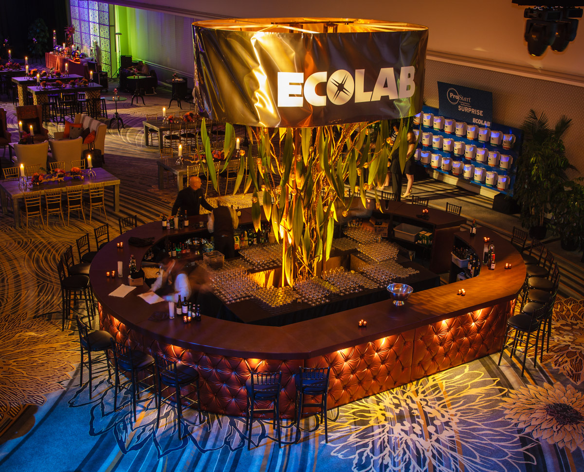
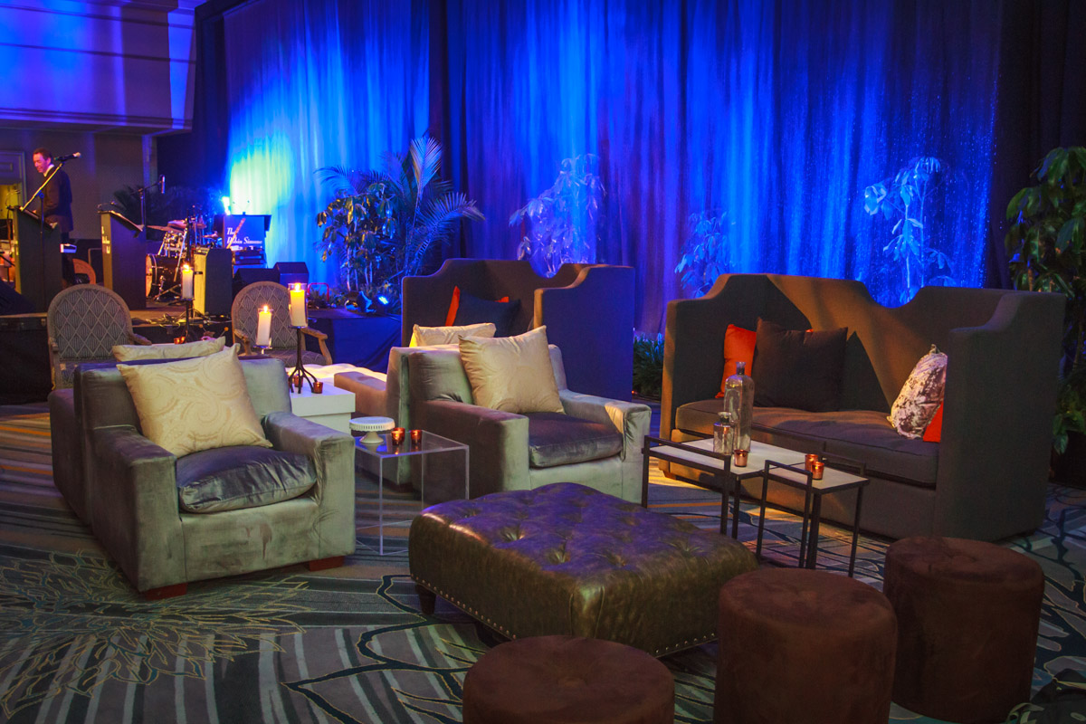
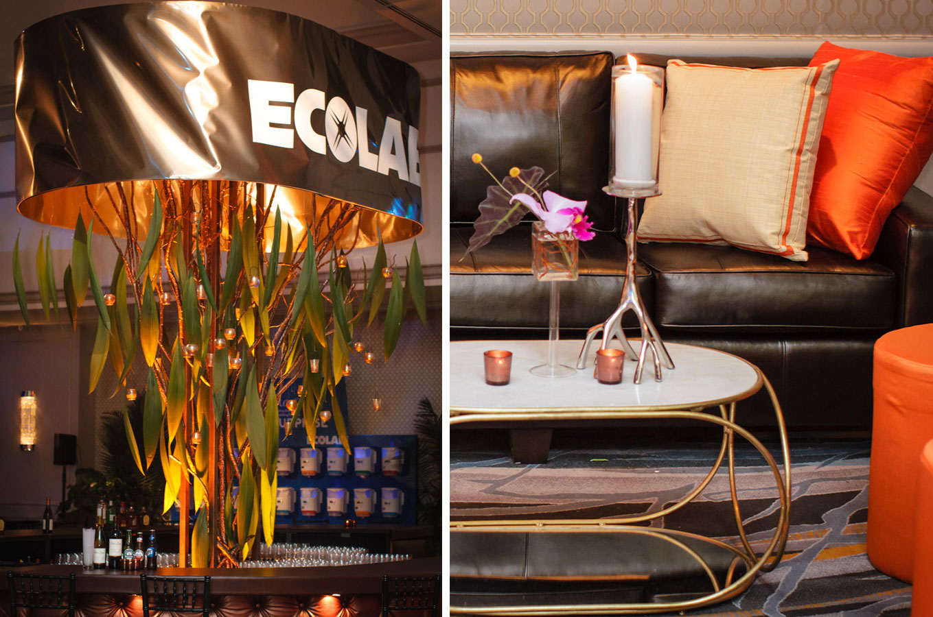
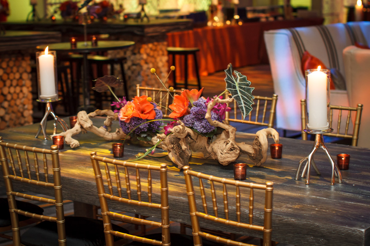
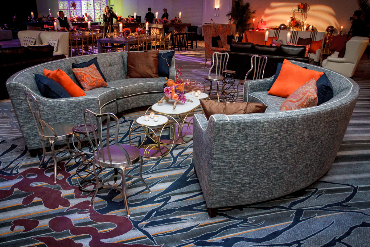
For last year’s Chairman’s Gala, Ecolab was ready to explore an entirely different look, opting for a strong natural design with a more masculine vibe. “We all agreed it was time to switch things up with a fresh new look, which was primarily grounded in a natural color palette of rich browns, soft pinks and bursts of orange,” says Lindsey Lider. “With this larger color spectrum, we were able to get more playful with Ecolab’s products in our designs,” adds David Beaupre. The registration tables, for example, picked up on the orange with brightly painted broom handles, creating a really cool backdrop to their branded logo. To finish the look, Kehoe Designs used Ecolab’s rubber hoses, mimicking a more natural rope-like element. And while blue lighting effects did provide the continuity of their trademark color, the overarching theme to the decor were things you might find in the woods: clay and copper earth tones, tree structures, exposed root candlesticks and pillow patterns, and tables dressed with manzanita branches hosting floral sculptures.
2014: Futuristic Fractals
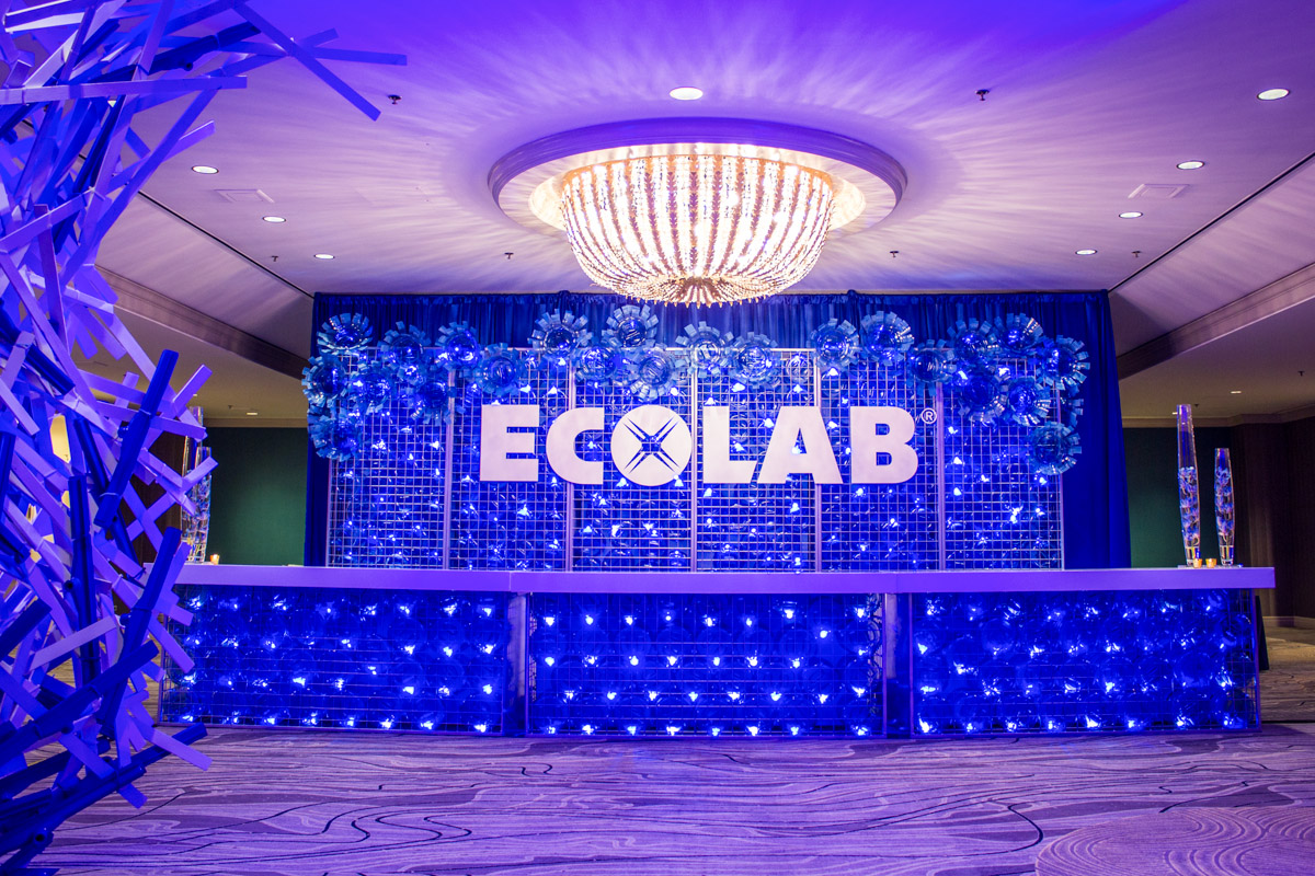
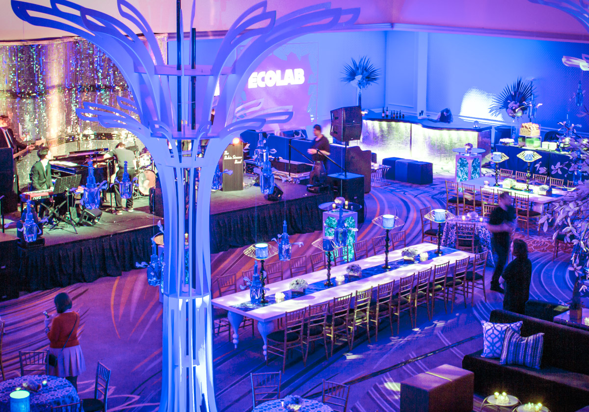
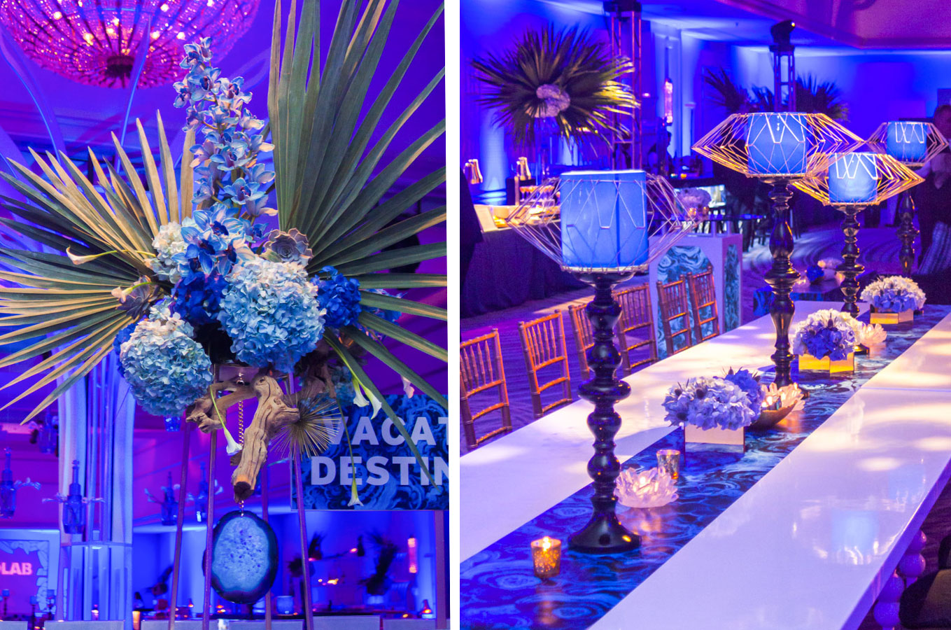
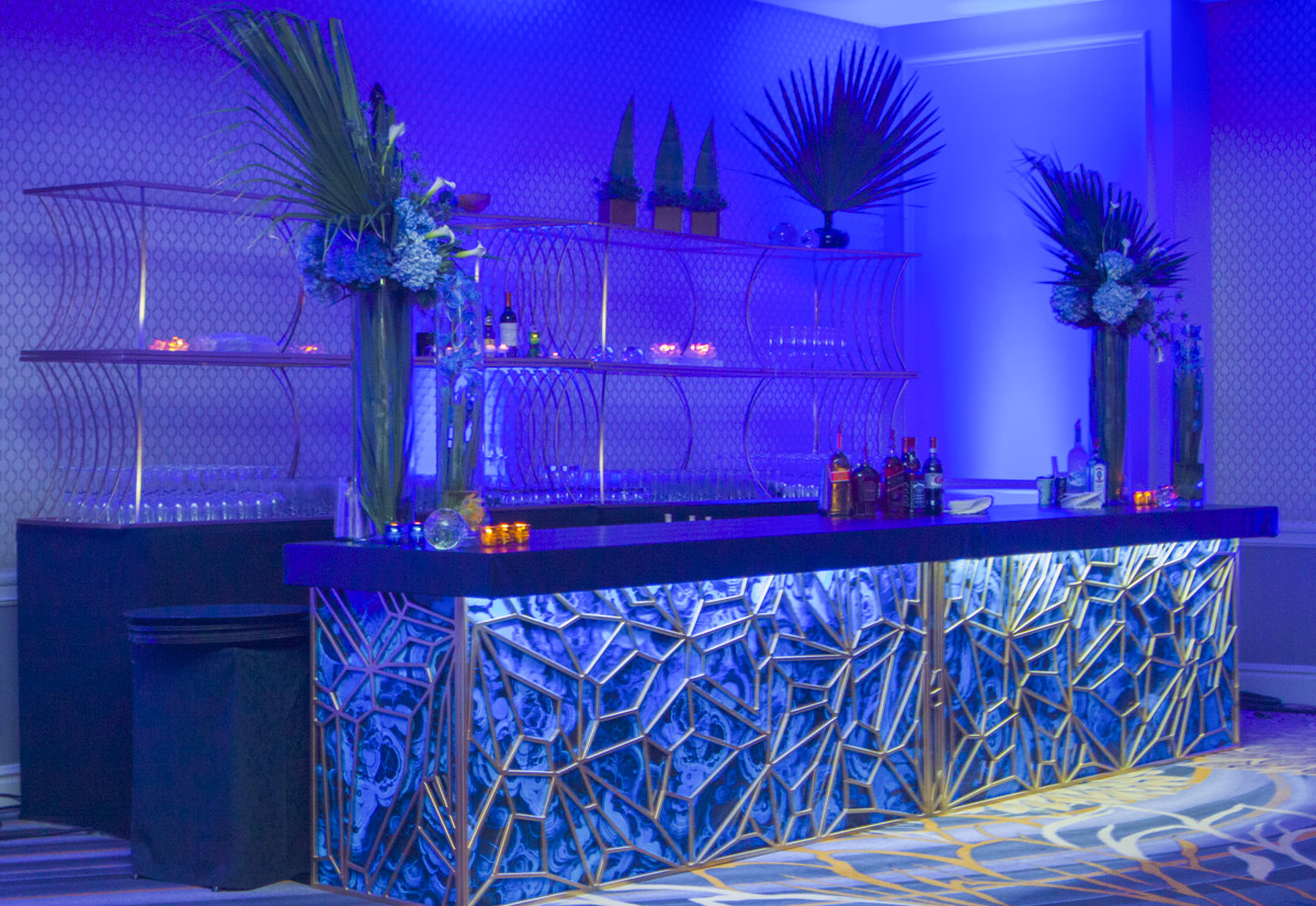
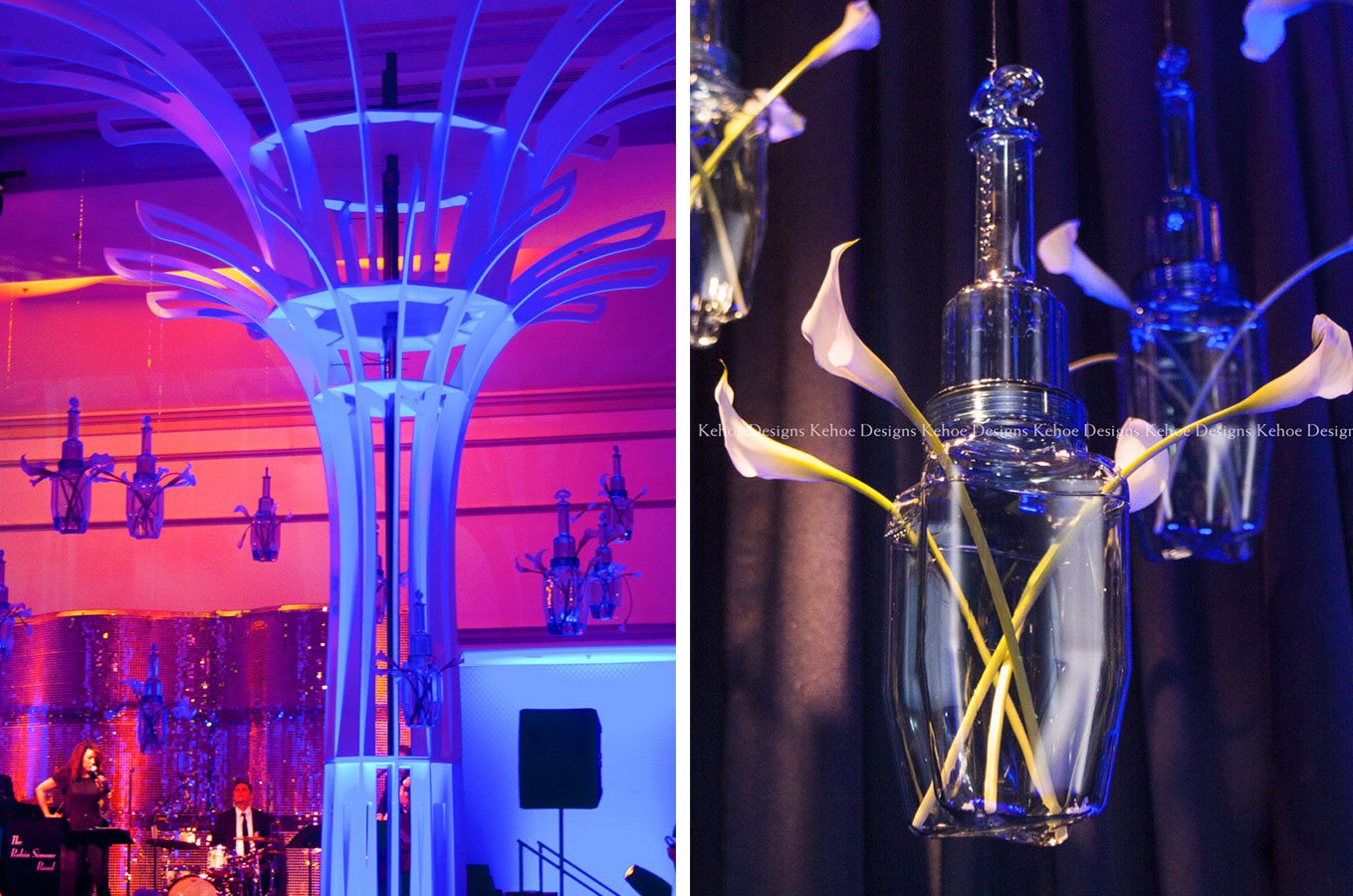
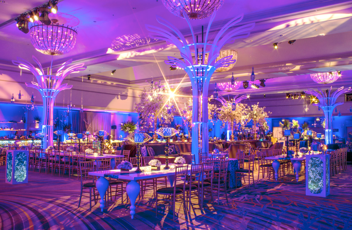
For this year’s Ecolab client event, the overarching theme was tied to the timelessness of natural stone elements. “We wanted to capture the fractalized textures of rocks and crystals throughout the design,” explains John Beran. Highboy and cabarets tables received blue agate graphic treatments. A bar front with geometric gold cut outs emulated angular rock elements found in nature. “We were also able to add some very unique custom elements this year, including massive tree-like sculptures inspired by the Lisbon Orient Station, a design by Santiago Calatrava,” adds Bridget Frizzie. From these large trees, the design team hung Ecolab’s clear plastic ice jugs used to cool down hot liquids. “It’s remarkable to see how a common item found in a restaurant kitchen could be transformed into what appeared like hanging crystals or beautiful blown glass, hosting calla lily blossoms,” says John. Not to be forgotten, however, was this year’s registration table, fashioned using stacks of large ice buckets, with some cut out to create fractal designs along the top of the back wall. Interestingly, while the designs were steeped in natural and timeless themes, the designs’ sculptural and geometric lines added a futuristic effect.
THE SECRET BEHIND CUSTOM EVENT DESIGN
We close this feature with a deep tip of the hat to some of the most talented members of our team; our production crew. The best kind of problem solvers, their craftsmanship and skills allow the designers to dream big with elaborate designs custom to each event. “We could not accomplish any of these concepts without our fearless Director of Production, Daniel Pupo. He is quite literally, the ‘brains’ that figures out how to execute our artist renderings and more importantly, how to install large-scale production pieces into an event space,” says Bridget Frizzie. “Many of the designs featured today are also largely in thanks to Andres “Nico” Martinez, Warehouse Manager, who leads a large team of welders and wood smiths ensuring quality construction and impeccable execution,” adds Lindsey Lider. “It’s amazing the knowledge these guys have gained in their ten plus years experience building event set designs. Their logistical know-how on electrical questions, structural engineering, and craftsmanship, is truly THE secret behind the wildly successful, wow-factor designs for which Kehoe Designs is known,” concludes Lindsey.
