Story of Color
2013 COLOR TRENDS
Emerald Wild
We saw Emerald, Pantone’s color of the year, authenticated by so many social trends from pop culture, fashion runways, culinary experiences, re-branded franchises, beauty products, interior design, home accessories & appliances, but perhaps most pervasively through the eyes of Hollywood movies.
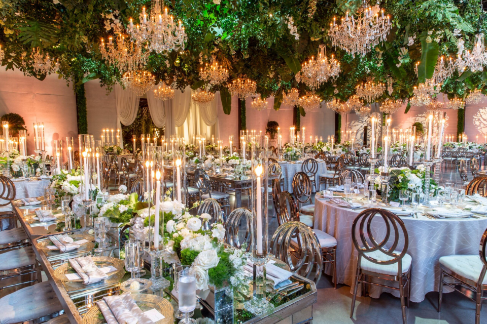
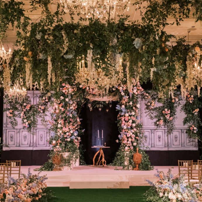
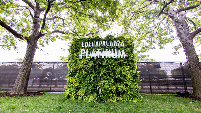
We see this richly verdant color emerge as a response to a call for the great outdoors; environments that breathe life, bright green landscapes that refresh. In the world of event design, it translates to plantscapes, monster boxwood dividers, and living walls. Inspired by the natural world, emerald green is brought indoors with set designs allowing guests to feel enraptured – invigorated – by the wild, whether it be an enchanted forest, a tropical paradise or a formal botanic garden.
[portfolio_slideshow id=344]
Omni Blue Moods
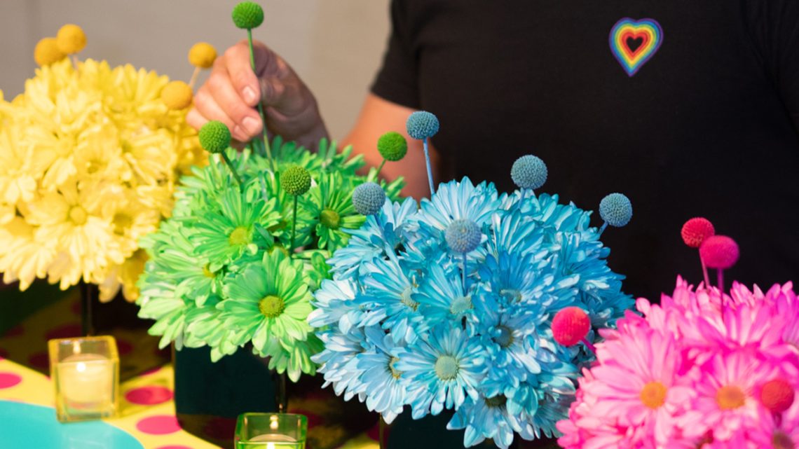
Universally, we saw a strong movement to blues inspired by Pantone’s colors for 2013: Dusk, Monaco and Mykanos. With these hues of blue, what comes to mind? We see Facebook and Twitter colors combined. This can be seen in beauty with YSL’s 2013 campaign, home appliances like Nespresso – the hardest working appliance in my house, home interiors and bold fashion runway looks.
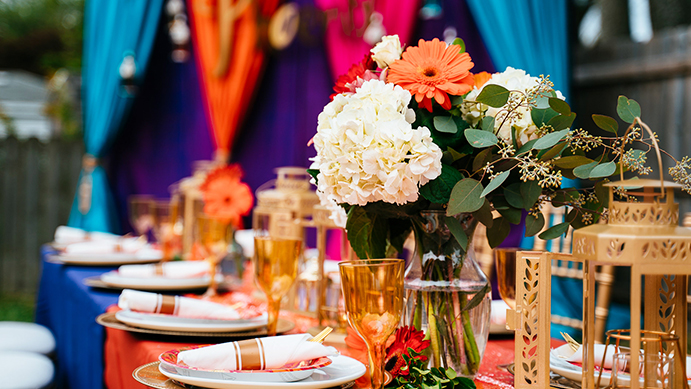
In the event industry, these blues perfectly complement current trends in both the wedding and corporate world. For weddings, we see dusk blue moods that feel very ethereal with crystallized casts, feminine dresses, wistful and dreamlike ambiances. Floral design sets the tone with its tender soft petal floral and graceful bouquets. For corporate, we transition to a deeper, saturated blue calling on inky, masculine environments with a soulful “rock and roll” vibe using layers of rich blues with purple undertones. In event design, we also see this blue influenced by the cool glow of LED lighting. We correlate it to a broader spectrum of forging new moods that welcome all sensory mediums; echoing social media’s call to fascinate and engage.
[portfolio_slideshow id=367]
2014 COLOR FORECAST
In 2014, Emerald green gives way to a worn turquoise, expressed through distressed finishes exposing texture and revealing layers of character. The once bright shade of green, faded by age and light, draws on the spirit of looking back yet also carries with it the positive notion of renewal and the calmness evoked by turquoise waters. Look for this worn turquoise coming through in designs with patinaed finishes and oxidized copper accents, precisely on trend with the “modern pioneer” style so present in fashion and Hollywood.
In the blue world, we’re also seeing a movement towards worn color by means of distressed, denim-like treatments. For Spring, expect to see these stormy blues paired with bright bleached woods and light aluminums. In fashion, we’ll see blues paired with grey taking on playful patterns and mixed media applications. Finally, anticipate the convergence of color spectrums where phosphorized green meets cool neon blue. This bold combination of color moods moves us to the space age, where past and future collide.
[portfolio_slideshow id=398]
Bridget Frizzie
Creative Director
Kehoe Designs
312.421.0030
www.kehoedesigns.com
